At the pulse of the industry
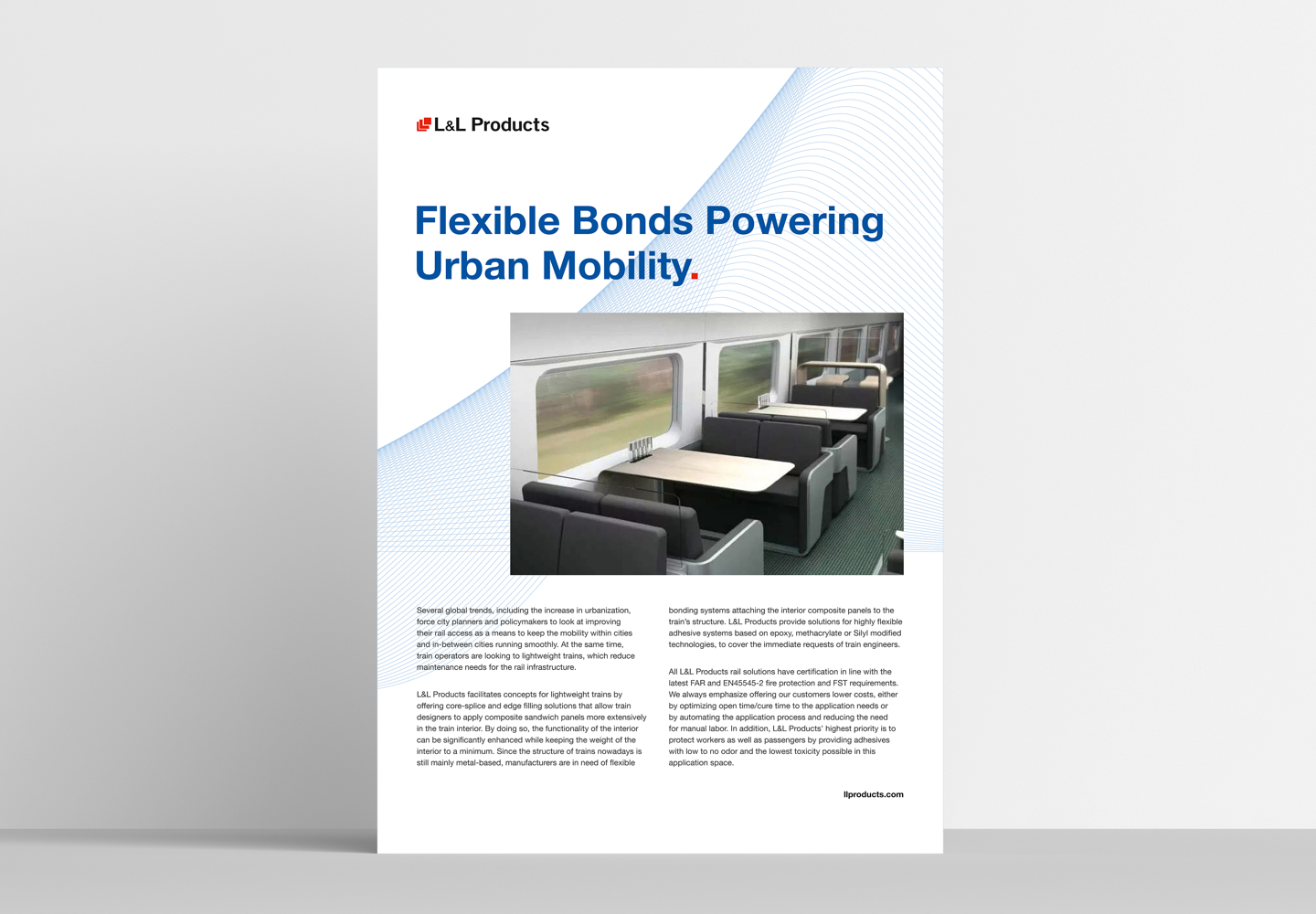
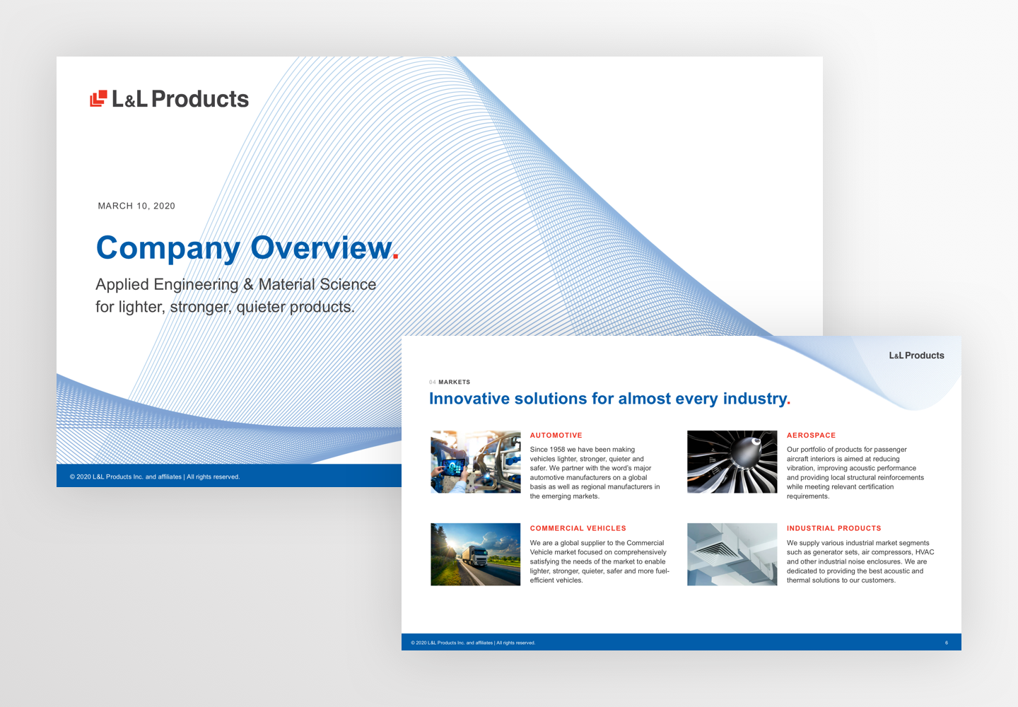
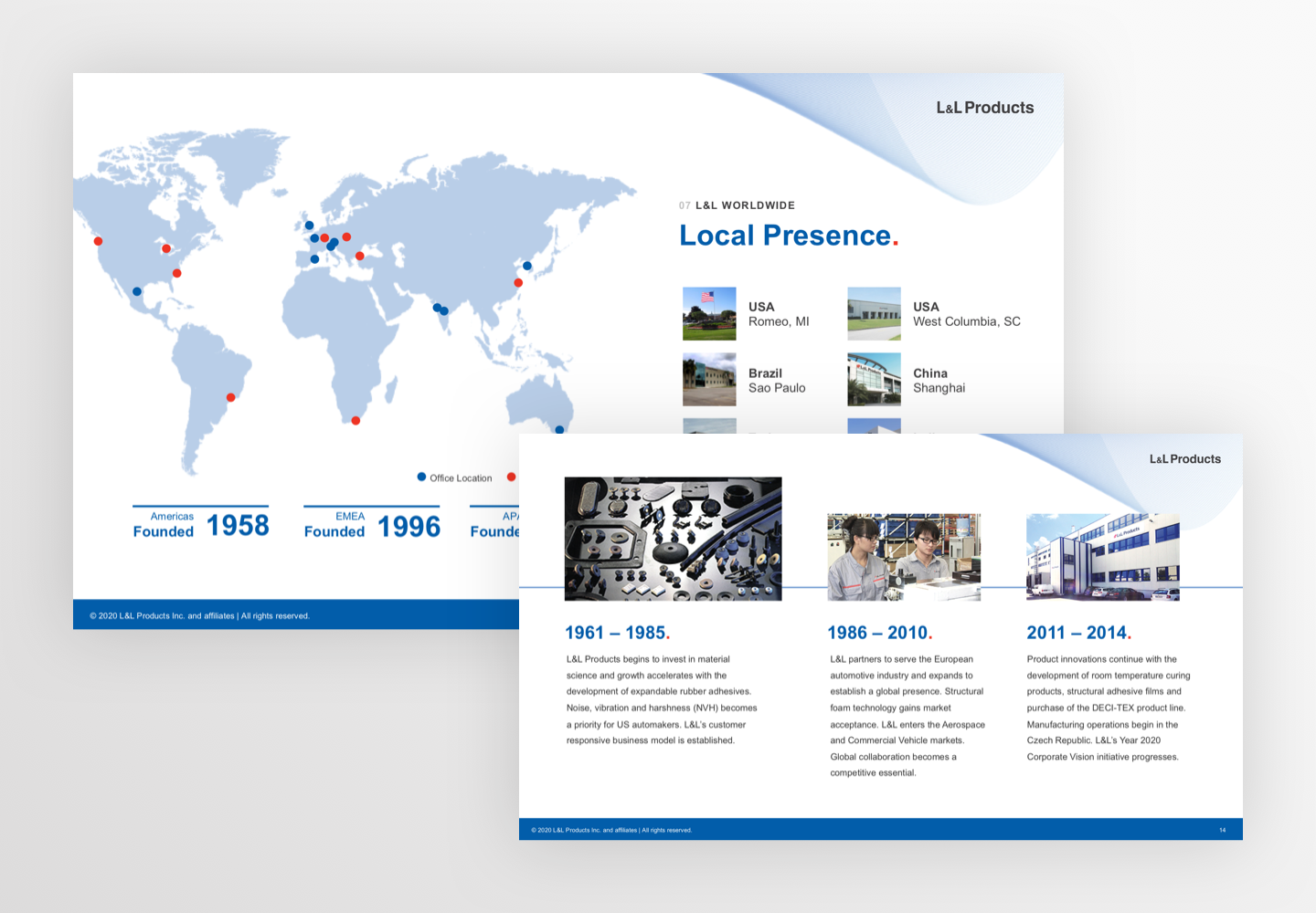
For the US-American company L&L Products, we carried out a complete rebranding and created a new corporate design as well as a new identity. The family-owned company has been producing adhesives, sealants and insulation materials for many decades for a wide range of markets, including automotive, aerospace, commercial vehicles and industrial equipment.
Through workshops and a close exchange with the customer we were able to work out the USP of the brand and mint the new look on it: L&L thinks and acts like one big family. A family in which everyone plays an important role. In which everyone loves innovation and thinks like an engineer.
- Customer
- L&L Products
- Deliverables
-
Corporate Design
Branding
Corporate Identity
Programming
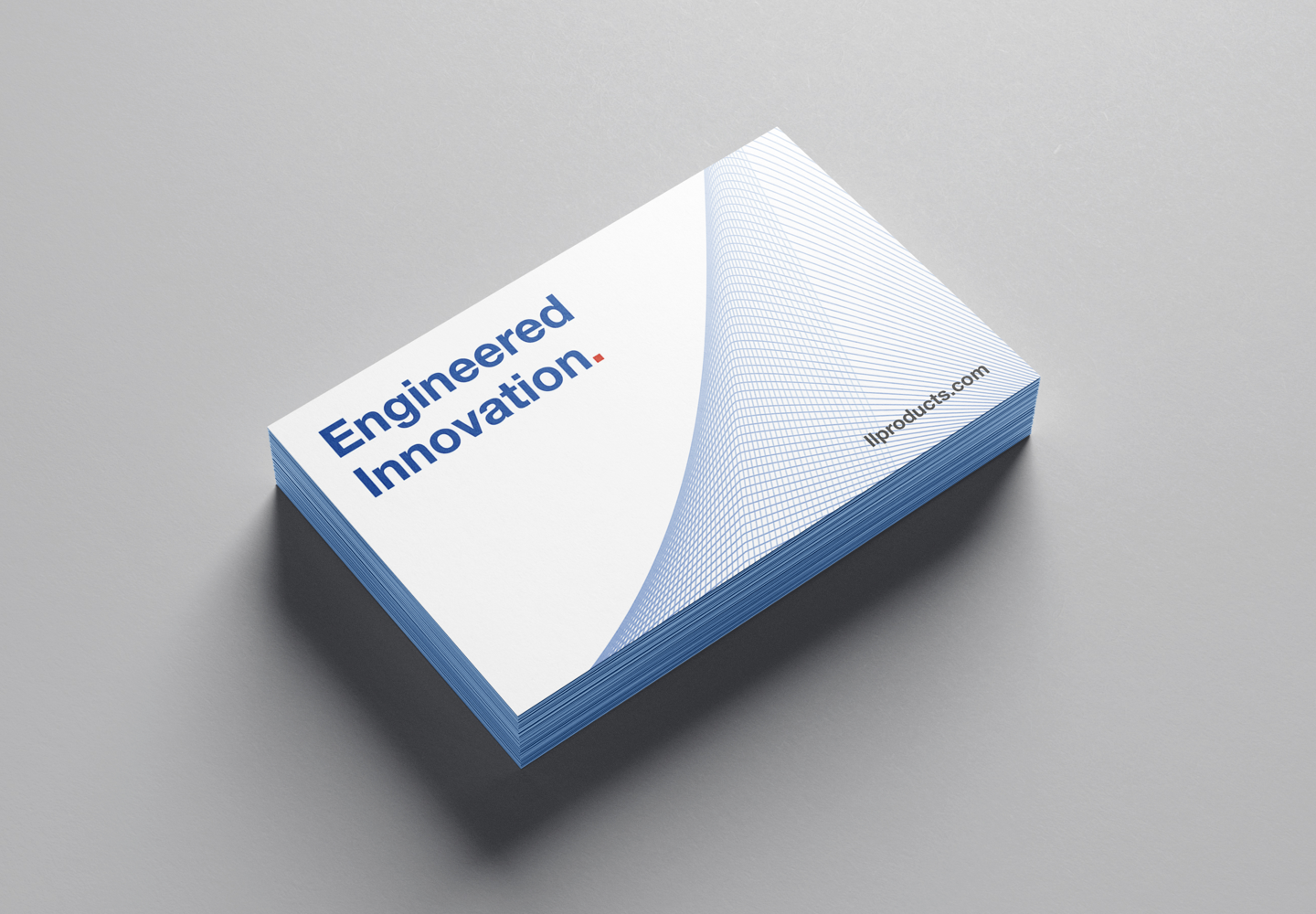
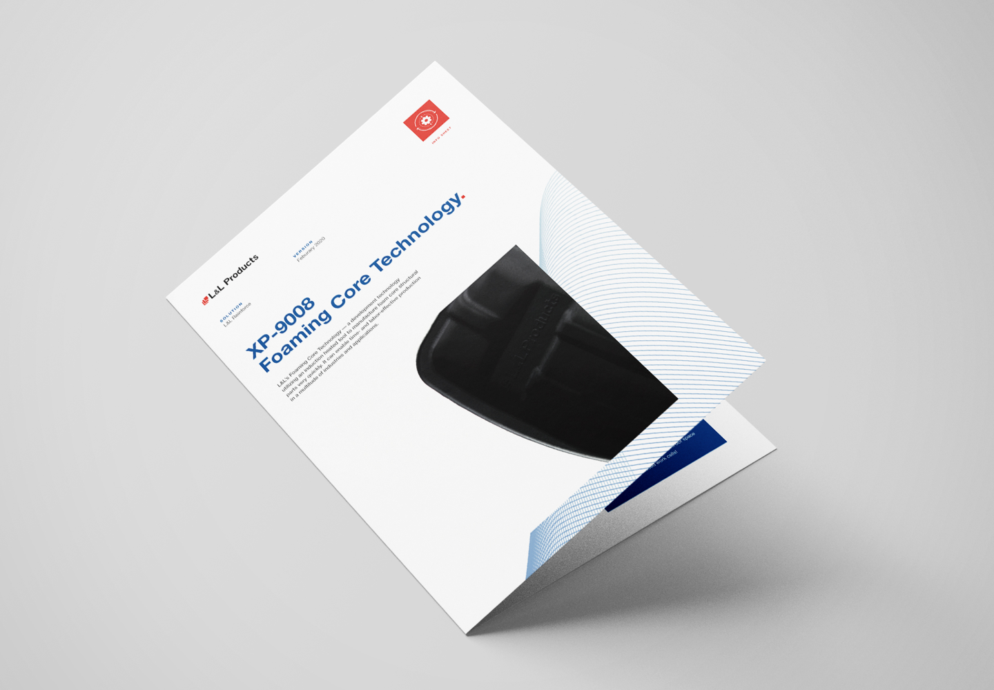
Stationery
Claim
Content
Illustration - Year
- 2020
A beating heart for innovation
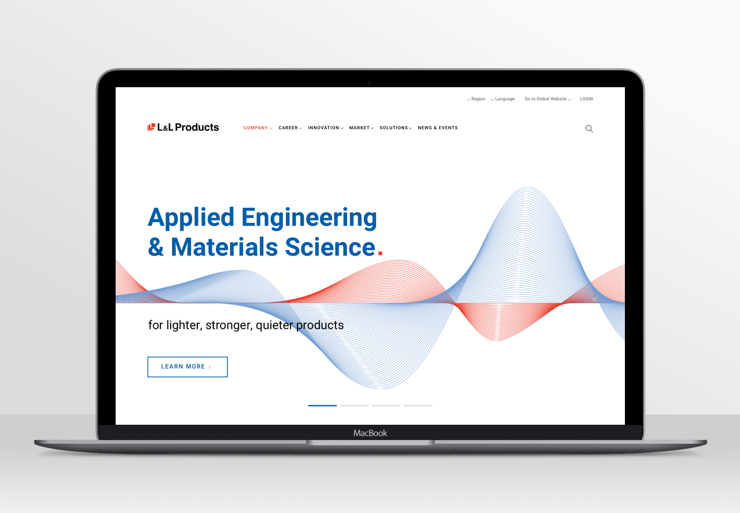
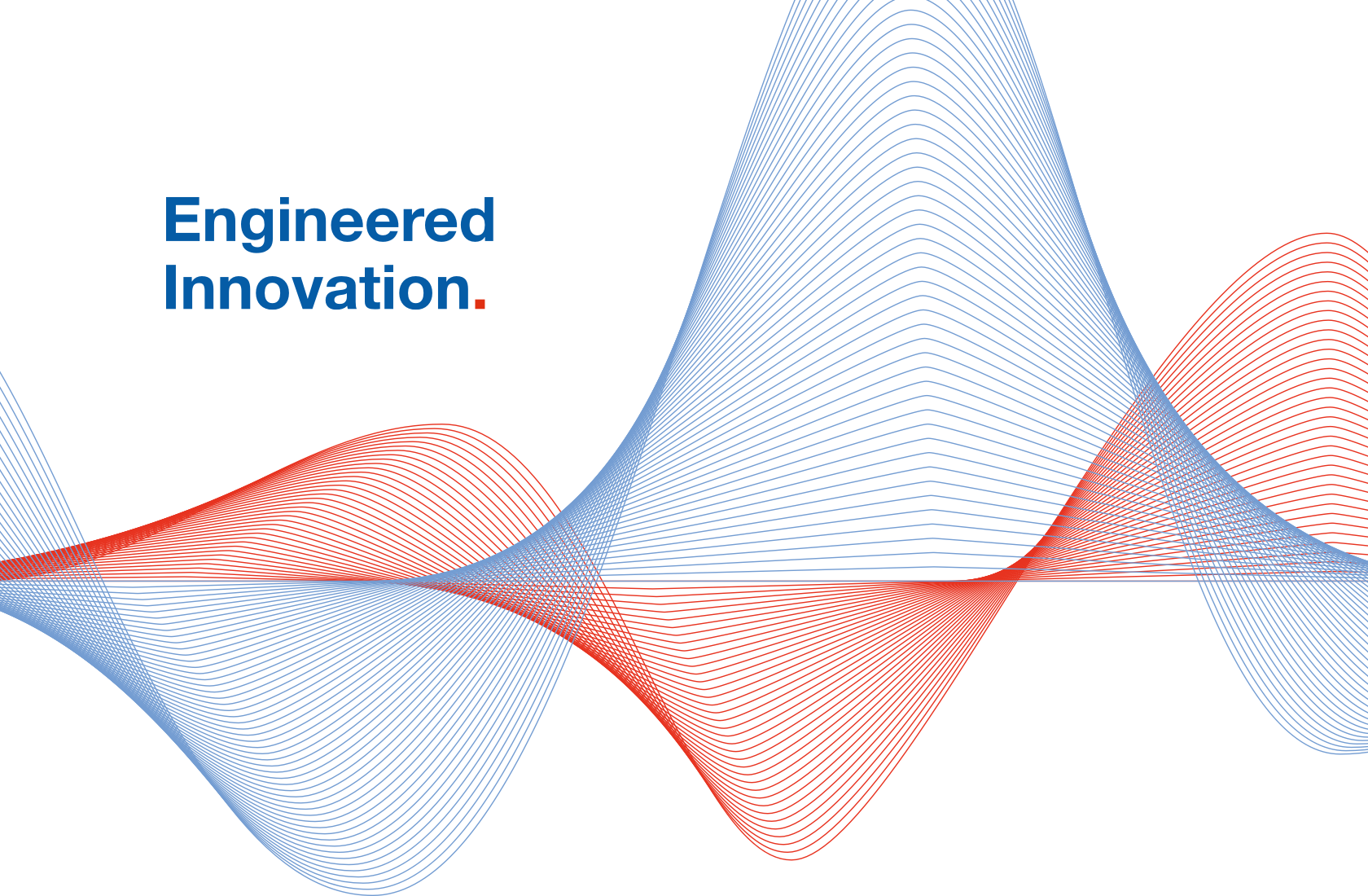
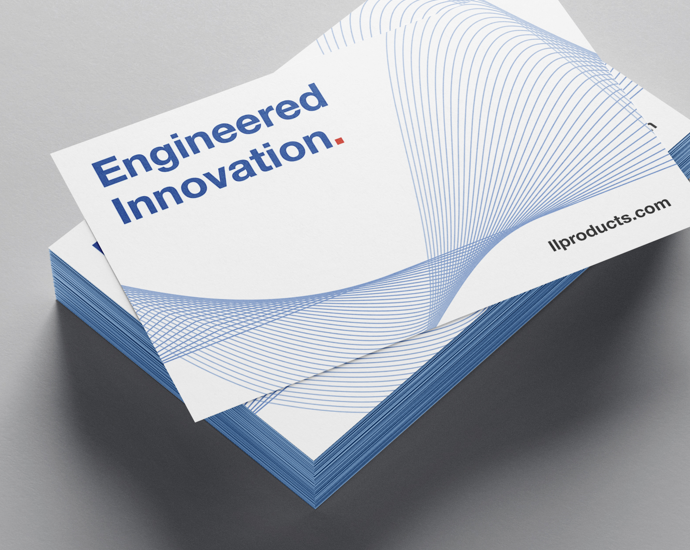
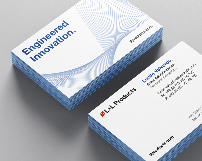
L&L Products is a future-oriented, innovation-hungry company that constantly strives for new ideas in a constant rhythm. Calm and yet strong and steady - like the heartbeat that guarantees a long life. This is why the sine curve in the brand colors blue and red on a white background became the core element of our design.
Another cornerstone of the design is the red dot at the end of headlines and other expressive statements. It is derived from the L&L logo and shows that the brand is particularly committed to these statements.
The sine wave represents the consistent, balanced way in which L&L continues to search for new solutions.
Kyra, Copywriter at Orange Hive
A new web experience
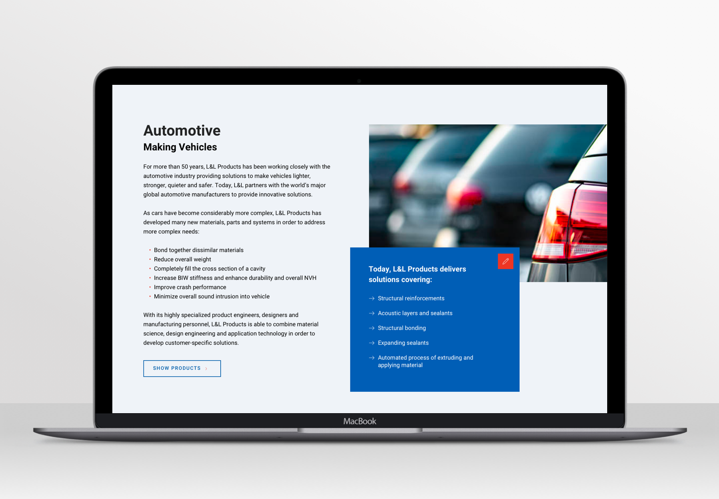
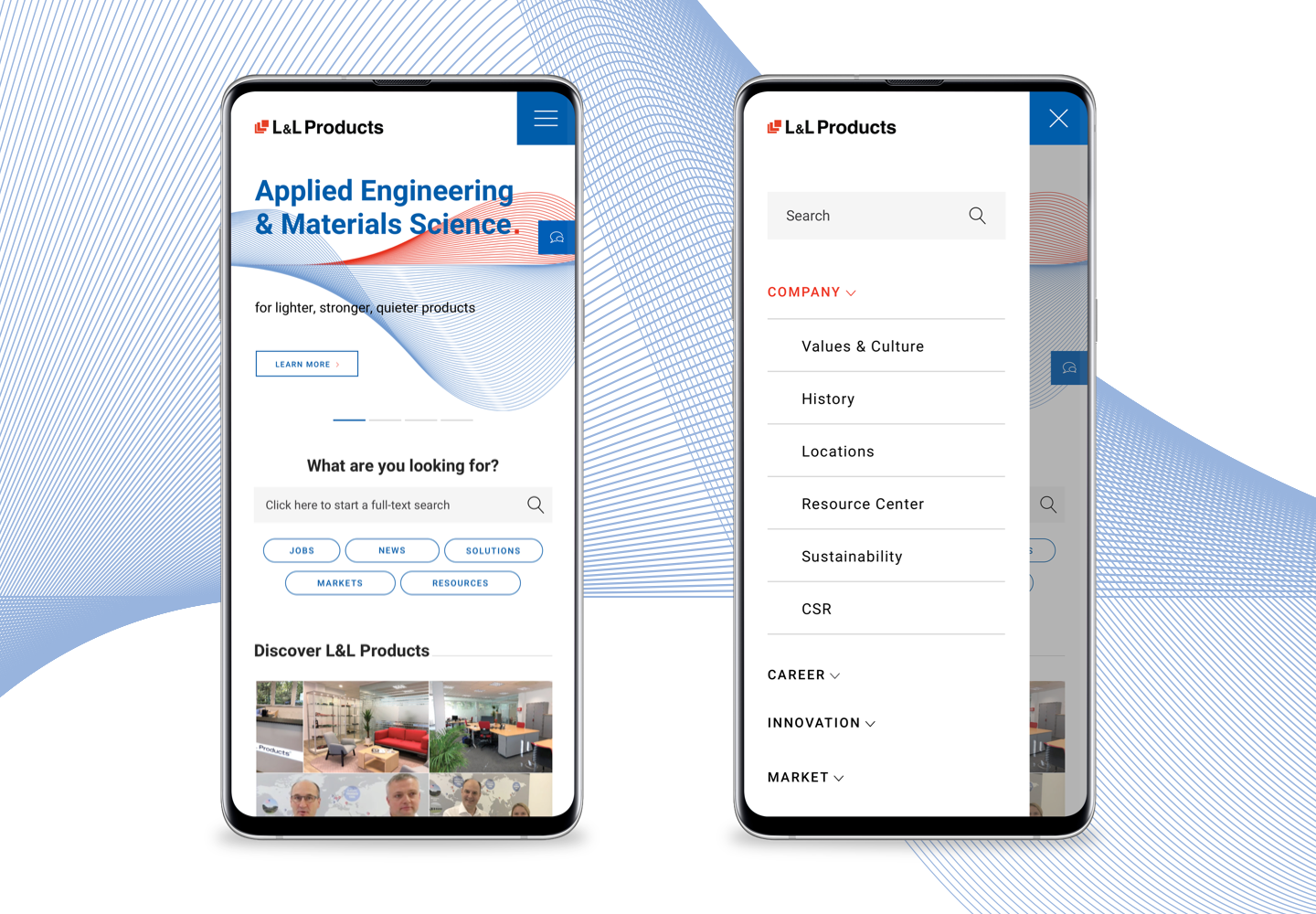
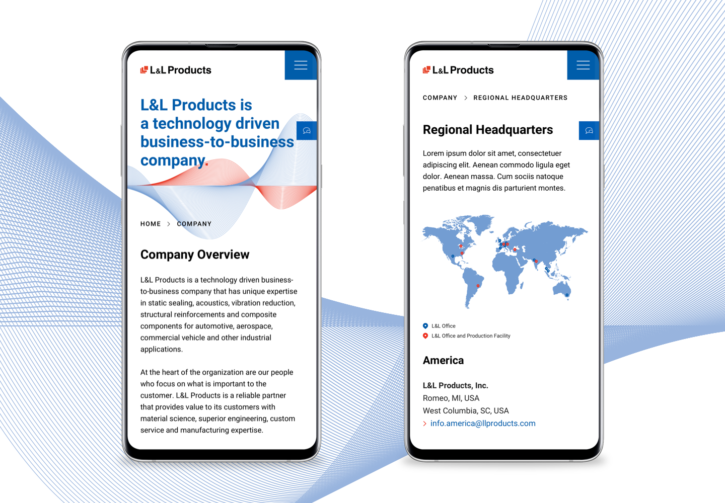
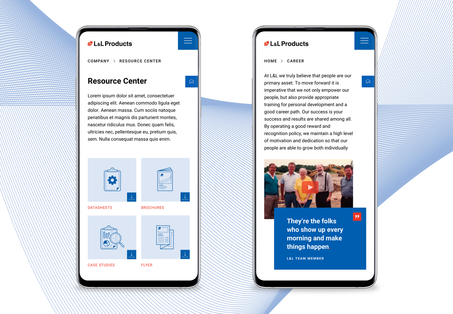
In addition to the stationery, we also redesigned the online presence of L&L Products from scratch. Using the latest version of the content management system Typo3, we programmed a website that can be flexibly maintained and thus kept up to date. All contents of the website were written, illustrated and designed by Orange Hive in cooperation with the client.
The site is optimized for use on mobile devices.
Clever & meaningful
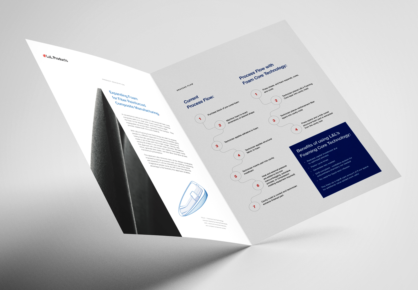
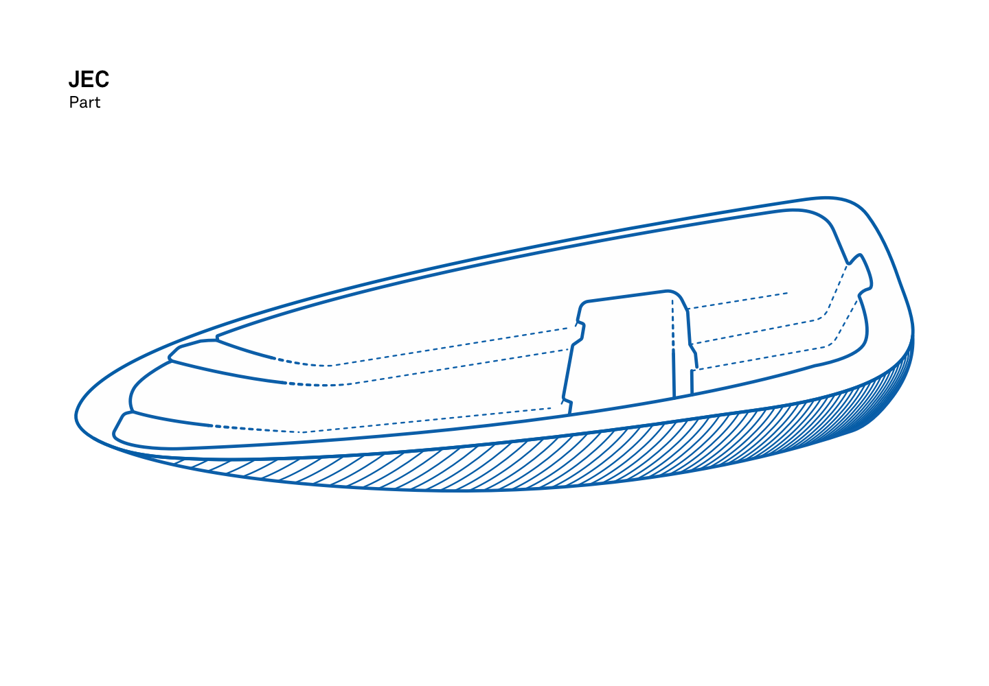
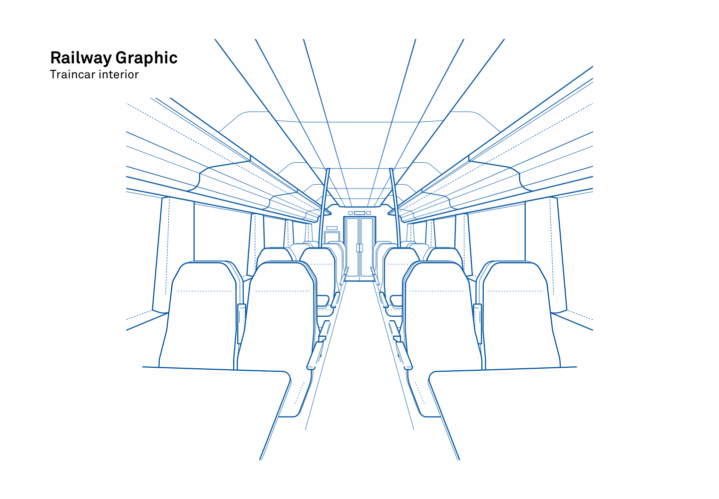
In order to give the brand even more dimension and to be able to ideally present processes, product highlights and important information, we have completed the CD with a set of pictograms and an illustration style.
The pictograms are rich in detail and designed with a slight contrast. This allows the more complex markings, which are necessary for the communication of L&L, to be clearly structured. The illustration style is kept graphic and clean with flowing shapes and minimalist details to reflect the flexible character of the brand.


