Same neighborhood, new look
The companies in the Rheinmünster Chemical Park have been relying on good neighborliness for decades – and this will not change even under the new management of the Trinseo chemical group. However, a fresh wind is blowing in corporate design matters. We have created a new CD that carries the tradition of the chemical park into the future.
- Customer
- Trinseo
- Deliverables
-
Corporate Design
Branding
Eventmangement
Stationery - Year
- 2020
Logo design and brand claim
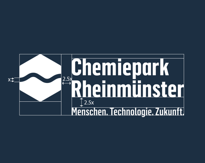
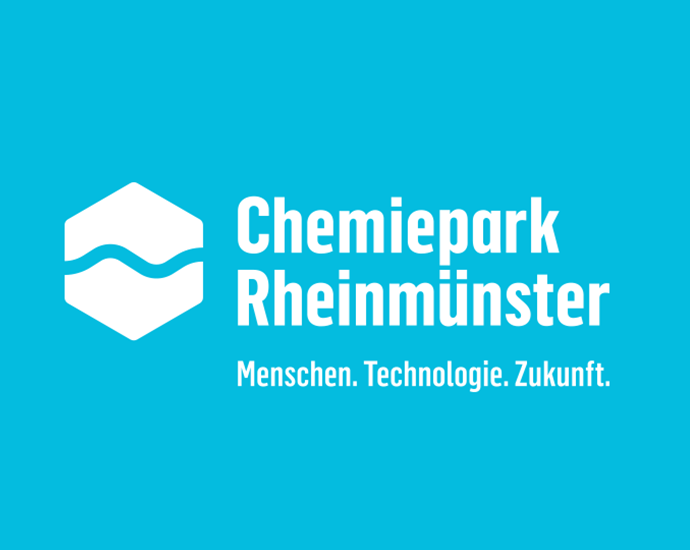
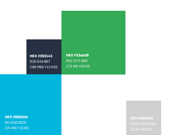
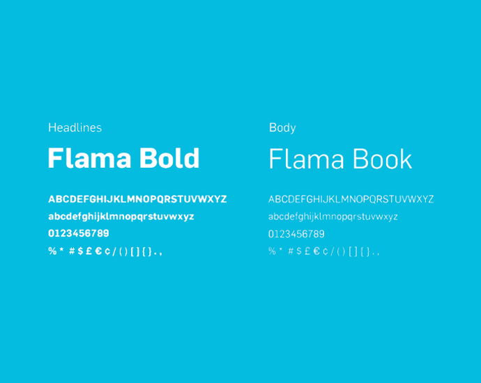
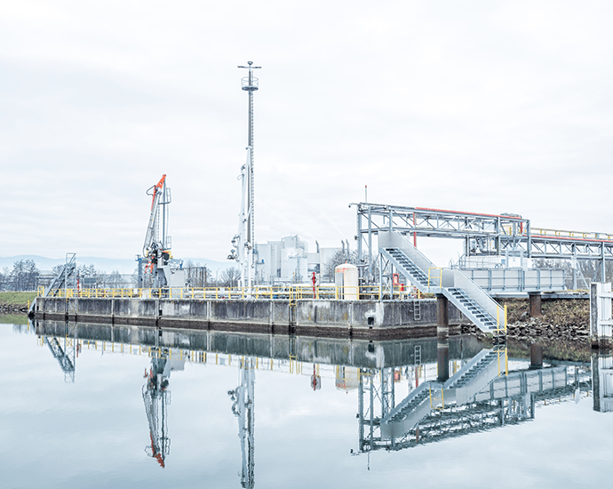
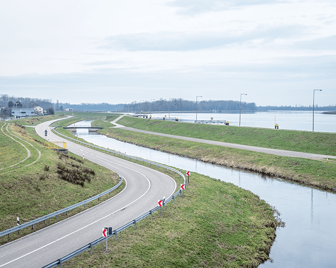
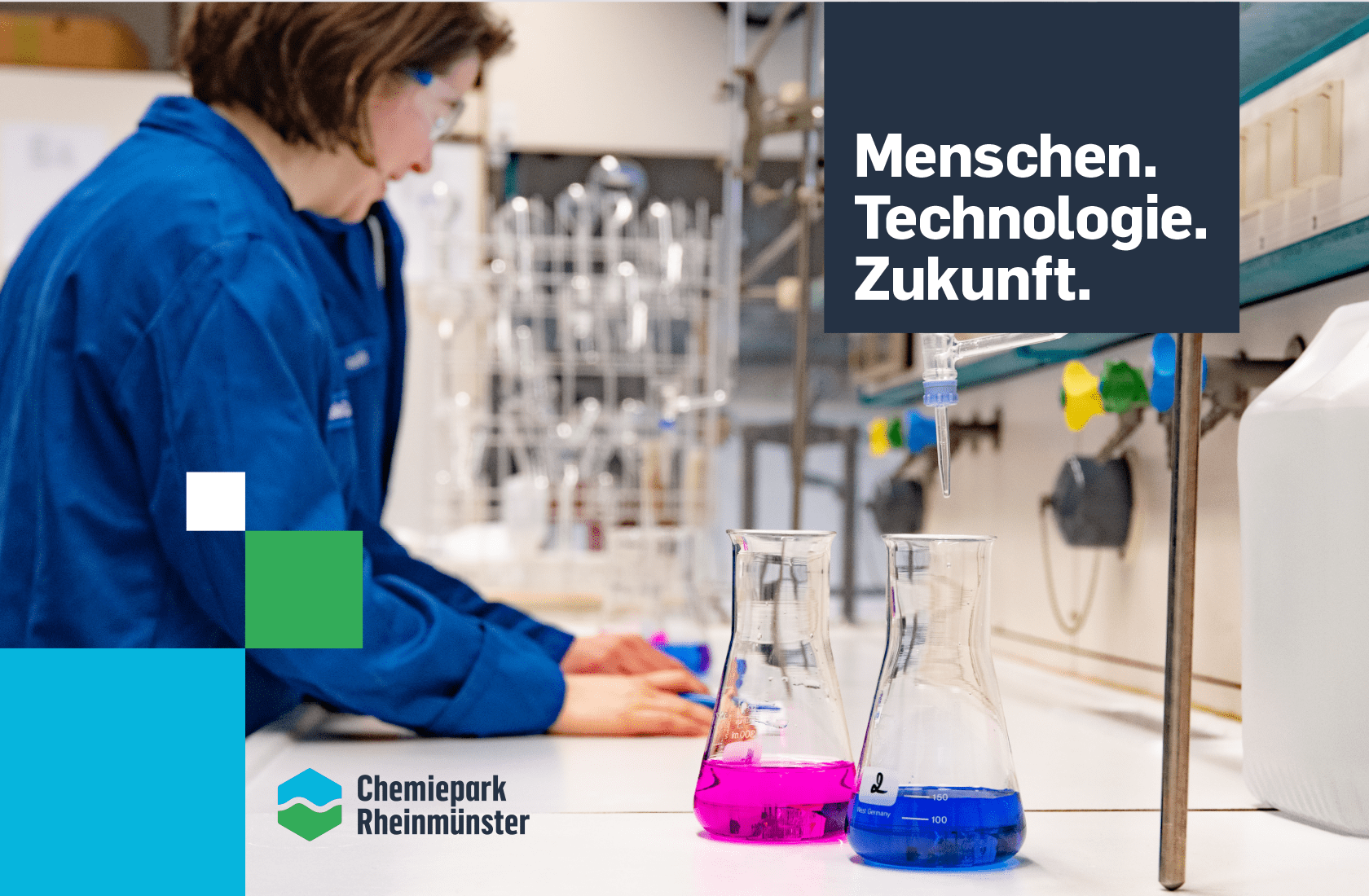
The design of a logo was at the centre of the new corporate design. In order to ensure a smooth transition to the new look, the old colors and logo font were adopted, but charged with a new symbolism. The main element, the hexagon shape, reflects the chemical background of the companies based in the park. The winding line represents the well-known location of the chemical park directly on the waterfront, and the mostly liquid raw materials produced there, such as latex and adhesives.
The word/picture mark was supplemented by the revised claim, which captures the philosophy of the chemical park in a pointed way.
A new logo can transform the whole character of a brand.
Eustachio, Designer at Orange Hive
It works. On paper and digital.
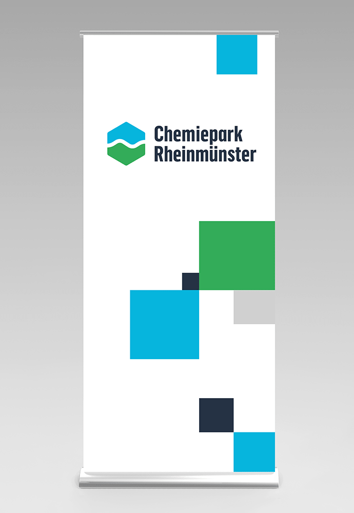
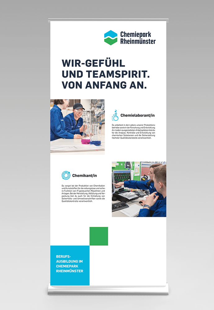
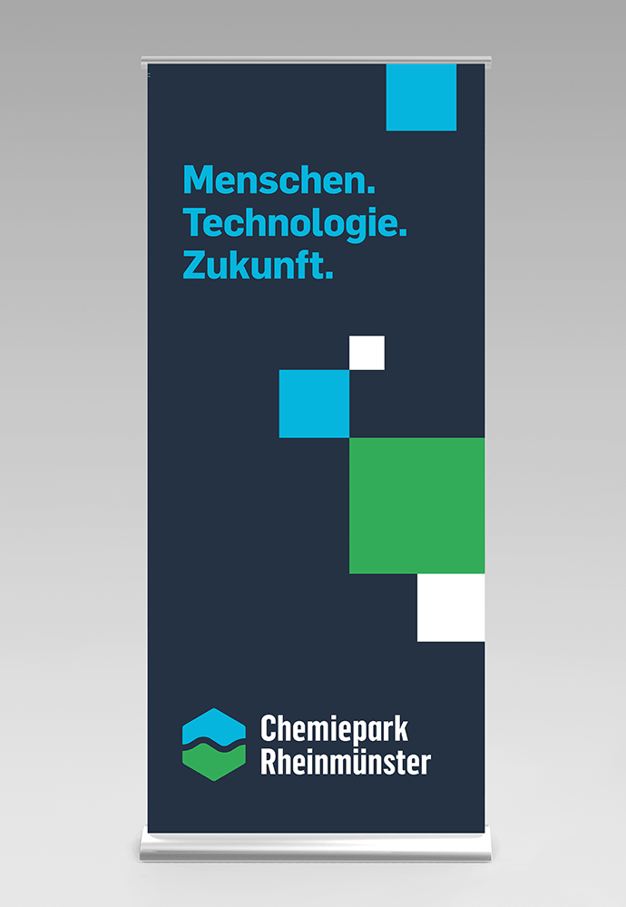
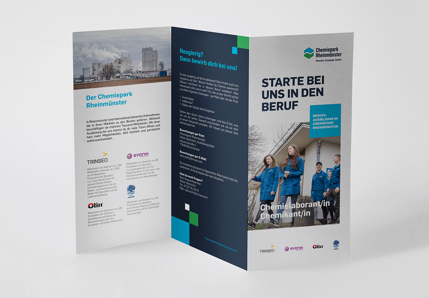
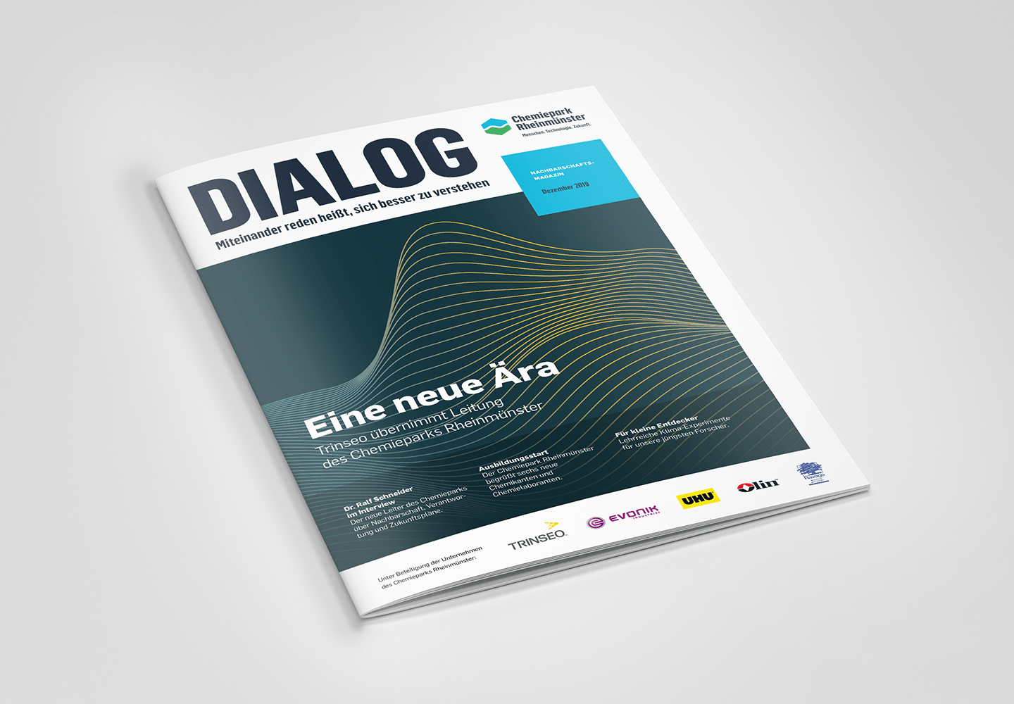
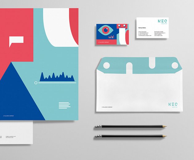
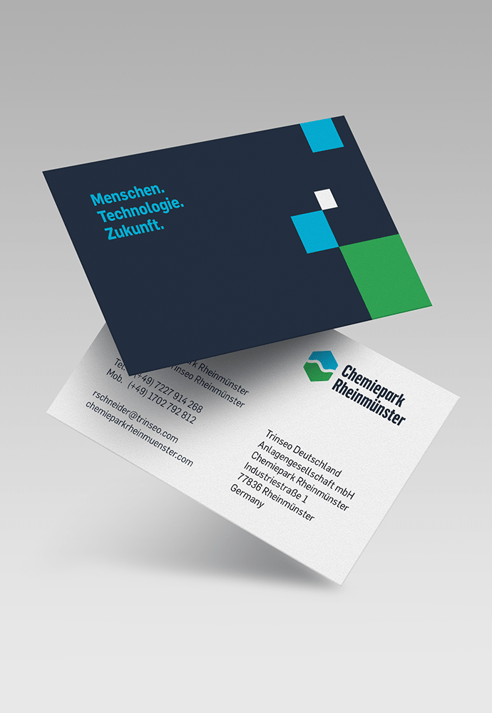
The corporate design was applied to all important print media of the chemical park, for example business cards, flyers and the neighborhood magazine, which is published regularly. The fact that the new color and form language also works perfectly on the screen is demonstrated by the animation video, also created by us, which explains the safety guidelines of the chemical park to visitors at the park and online.
